WINTER!!!!


Character planning 

Deciding my colour sceme 
Deciding my use of shapes werent exaggerated, so changed up my character. 


MY FINAL RENDERS BELOW! 🙂
- Write a brief analysis (one paragraph) including the following:
Your initial prompt choice and idea:
Out of the three choices which were given, my initial choice was winter! With the season of winter, I felt like I could express a character’s personality more and how they feel about their environment.
How you applied the principles of structure, aesthetics, diversity and designing for motion to your work:
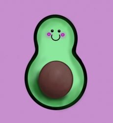
Within my project making, I chose to design a non-binary character, so as viewers we can relate more to it. Male or female, whoever, we have a chance to relate to a cosy character like Squishy. With my character, It has a use of circular and oval shapes to make it a soft and warm character. We don’t refer to it as scary, but rather cute. Everything rounded we refer to as cute and plushie-like, so ‘Squishy’ is someone you’re comfortable talking to.
A personal and honest reflection of the outcome:
I am pleased with my outcome as I’ve never deeply explored character designing before, but it was extremely fun and I managed to create a character resembling something. However, I feel like I could have exaggerated the character’s shapes a bit more to make it pudding-like or more circular – At the moment it’s body being too stretched.
2. Combine your PNG image, any character pose sketches from step 2 (optional – only if you feel they add context to your final coloured sheet) and your analysis onto a single A4 Landscape page. Save this as a PDF using the naming convention: Character_Rotation_Submission_FirstName_LastName

